Admin User Dashboard

Hear me talk about this project:

Lead product designer
2021
Developers, Project Manager, Account Director (Internal), Program Manager (Client), Utah System of Higher Education (USHE)
Problem
Every October, the Utah System of Higher Education (USHE) launches "College Application Week" to encourage high school seniors to apply to in-state colleges. The existing guidance feature was outdated and lacked the depth required to assist students through complex steps like financial aid and scholarship applications. The client needed a comprehensive, redesigned checklist tool that could serve as a primary guide for students both in and out of the classroom.
Results
I designed a centralized College Application Checklist that unified disparate resources into a single, gamified mobile experience.
The feature successfully launched in alignment with Utah College Application Week, providing students with a step-by-step roadmap for institutional research, applications, and FAFSA submissions.
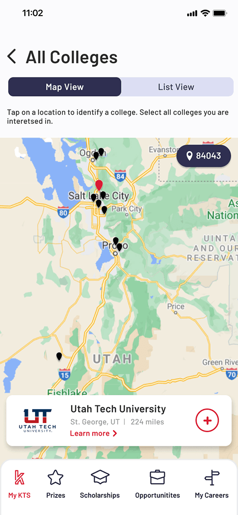
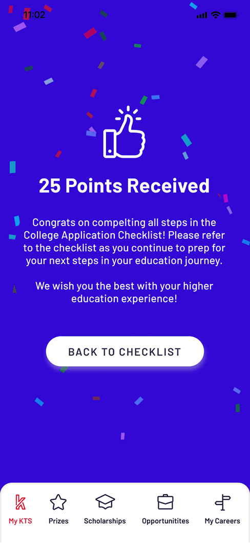
Key successes included an interactive Google Maps integration for school discovery and a gamified points incentive (25 points for completion) tied to the platform's broader rewards ecosystem. By repurposing legacy assets into a new detail-oriented UI, I delivered a production-ready tool on a condensed timeline that empowered students, especially those without family college experience, to navigate the higher education landscape with confidence.
27k+
App downloads
8,000
Applications submitted in 1st year
10+
Educational data stream unified
Process
Research & Strategy
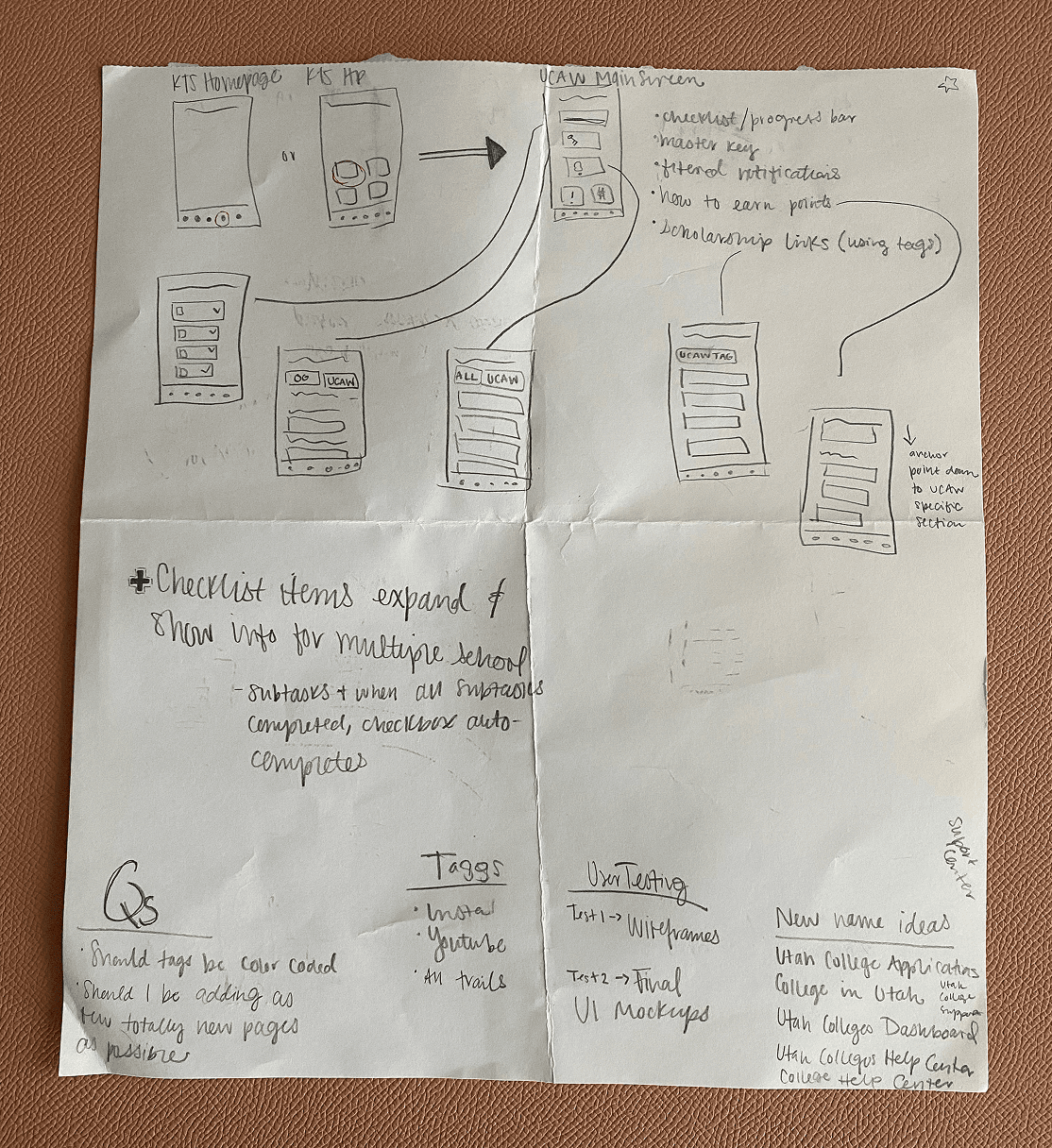
Conducted in-depth UX/UI research on task-tracking, progress indicators, and list logic to determine the most intuitive way to present complex, multi-step requirements.
Stakeholder Alignment
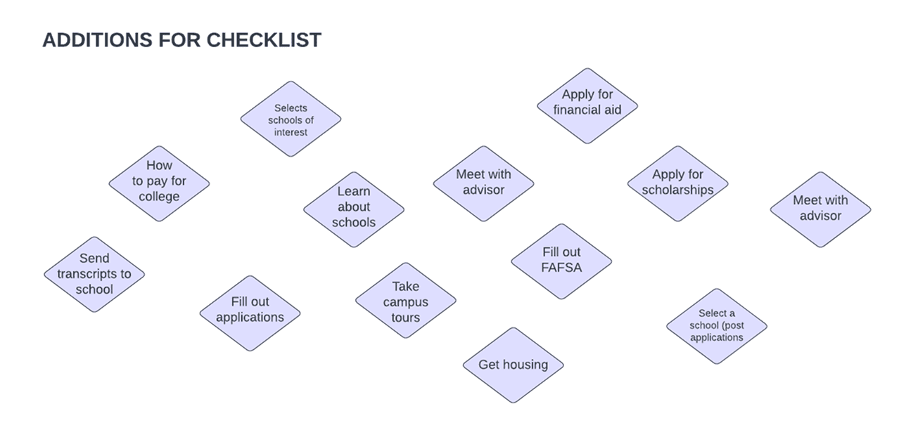
Facilitated interview-style sessions with USHE and KTS stakeholders to align conflicting priorities and define the first draft of the "Essential Checklist" items.

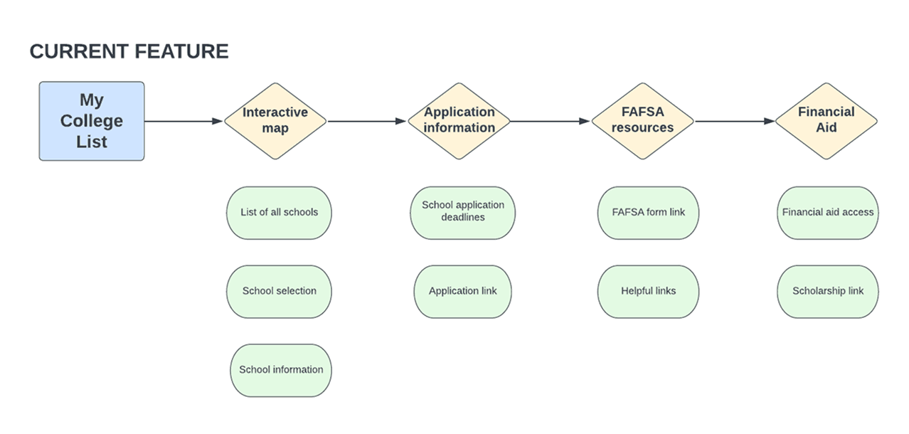
Feature Auditing & Asset Recycling
Performed an inventory of the existing app to identify screens (like the in-state school list) that could be refactored into the new flow, saving development time without compromising the user experience.
Iterative Information Architecture
Wireframing: Explored sub-task systems for multi-school applications but pivoted after realizing the repetitiveness of the UI.
Final Solution: Implemented a "Details Screen" pattern where top-level checklist items lead to specific sub-tasks, keeping the main view clean and manageable.
Interactive Design + Gamification Strategy
Enhanced the legacy school list by building a Google Maps-powered interactive view, allowing users to toggle between list and map views and see institutional proximity based on their zip code.
Integrated the feature with the app’s internal economy, rewarding students with 25 points upon completion to drive engagement and retention during the critical October application window.
What I Learned
This project taught me how to take a high-stress, process and distill it into manageable, bite-sized tasks for a teenage audience. It was a masterclass in stakeholder management; designing for a statewide initiative meant balancing competing goals from various organizations while keeping the student's needs at the center.
Ultimately, this project solidified my mobile-first design philosophy, proving that even the most complex bureaucratic processes can be made accessible and even rewarding within the constraints of a mobile screen.